Anyway!
The time came to pick the primary color of the light source. Since the model is in the cold green/beige gamut, (even the gold is soft, more beige than yellow), a warm saturated color would both stand out and complement everything well. In theory.
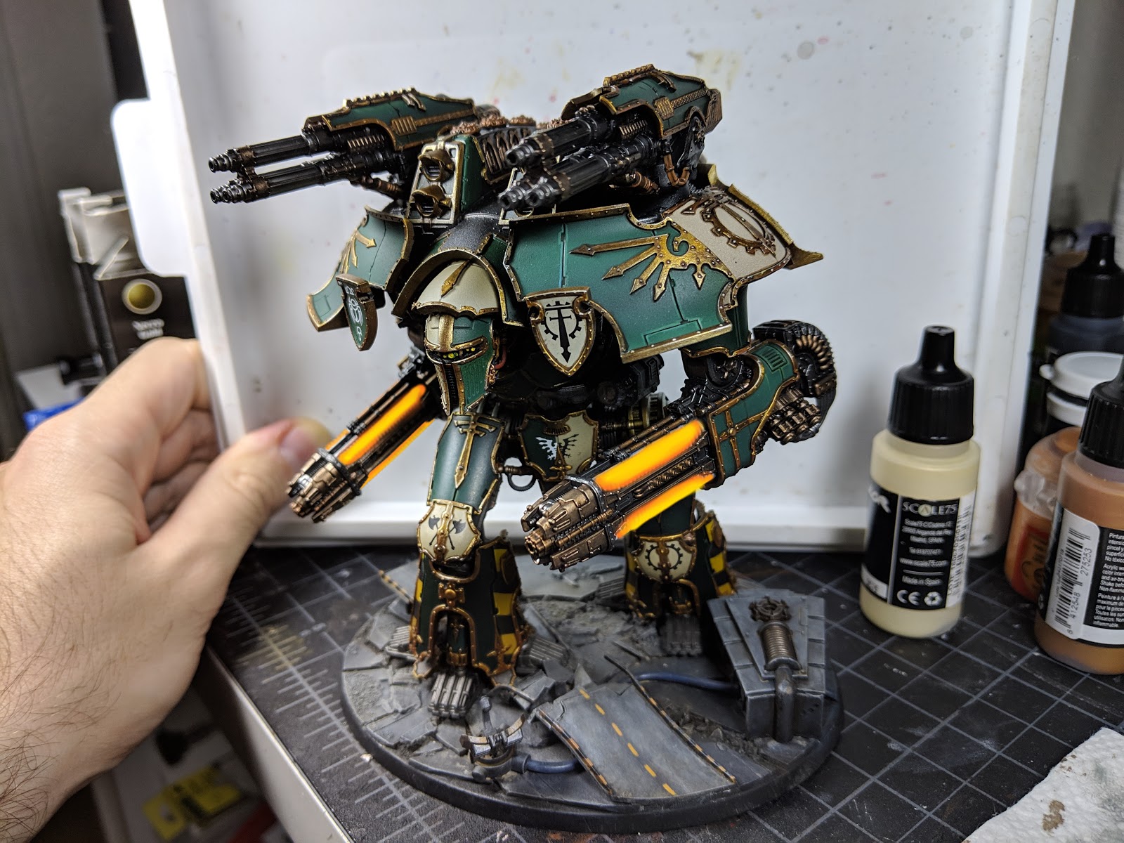
I took a photo of the model and attempted to edit in colors to see how that would look like.

I used Gimp for this purpose. I don't have Photoshop at home, and you're unlikely to need it for home use anyway. If you have access to Photoshop, great, this tutorial should apply. If not, use Gimp, it's great.
After opening the image, add two layers and paint them white using the paint bucket tool. You can check whether the layers are all white by turning their visibility on and off. Then, to both these new layers, add a Layer Mask that's fully transparent. Your two layers will go transparent again, that's fine. Think of a mask layer as a layer that hides parts of the layer that it's masking; here it's hidden everything.
Here's where the fun begins. Pick one of the layer masks and use the brush tool to draw on it. You'll see white come back where you draw; this is because the actual layer beneath the mask is all white. Use the eraser on the mask layer to hide parts of the actual layer.
Here I've used one of the mask layers as the backdrop, and the other as the highlight color. The second layer only covers what would be the brightest parts of those weapons.
After that, paint one of the actual layers orange, the other yellow. Use the paint bucket tool to do this. Since the actual layer is all one color, it will work fine. You'll get something like this:
Or maybe something like these:


Using other tools you can even rotate through the entire color wheel and see the changes that's making to the model. The images I've included here are only the ones that looked half decent; most other colors clashed too much.
Here I tried increasing the intensity by making the background yellow/orange instead of red/orange. I'm not a fan, but I was curious about what this'd look like:

Anyway, I'm going with red/orange/yellow. It looks the best; it stands out while fitting in at the same time.
I hope this helps; please ask questions below if you'd like to know more. Thanks for looking!
That’s some clever trickery there Wizard!
ReplyDelete