Necrons have amazing models, detailed and interesting infantry with a lot of potential for object source lighting, and vehicles with a lot of depth and detail. I love the look hordes of units, and hordes of Warriors and Immortals have a huge potential to impress.
What keeps Necron armies down visually is the color scheme. Drybrushed metallic colors over black is such a natural choice and so easy to do. In addition, translucent green rods that Warriors use guide all Necron armies towards a natural black/dark metal/green color scheme. It's ok, but it's boring. Not only is it typical and predictable, but all that black does injustice to the models. There's so much detail and depth that gets lost in all that black.
Take a look at this Annihilation Barge model. This is a beautiful model, but it is hard to distinguish any detail in it. Below and behind the gun especially. And this is painted with extraordinary effort, where every single edge is highlighted with green gradients. What gives?
I decided to strive towards a paint job where no surface would be left behind. Nothing would be left entirely black, instead painted with gray gradients. If it is still dark and visible on the table top, it should have some object source lighting (OSL) to exaggerate the detail.
Finally, I like the idea of having a material theme that is closely tied to theme. For example, a plain looking metal material that would dominate on Warriors, a heavy armor looking material that would dominate on vehicles and heavy infantry, and an elite material that denotes prestige. Sprinkle with details and the army looks unified yet diverse.
---
So, time to google Necron armies and see what people have done. In the end, two color schemes resonated with me the most:
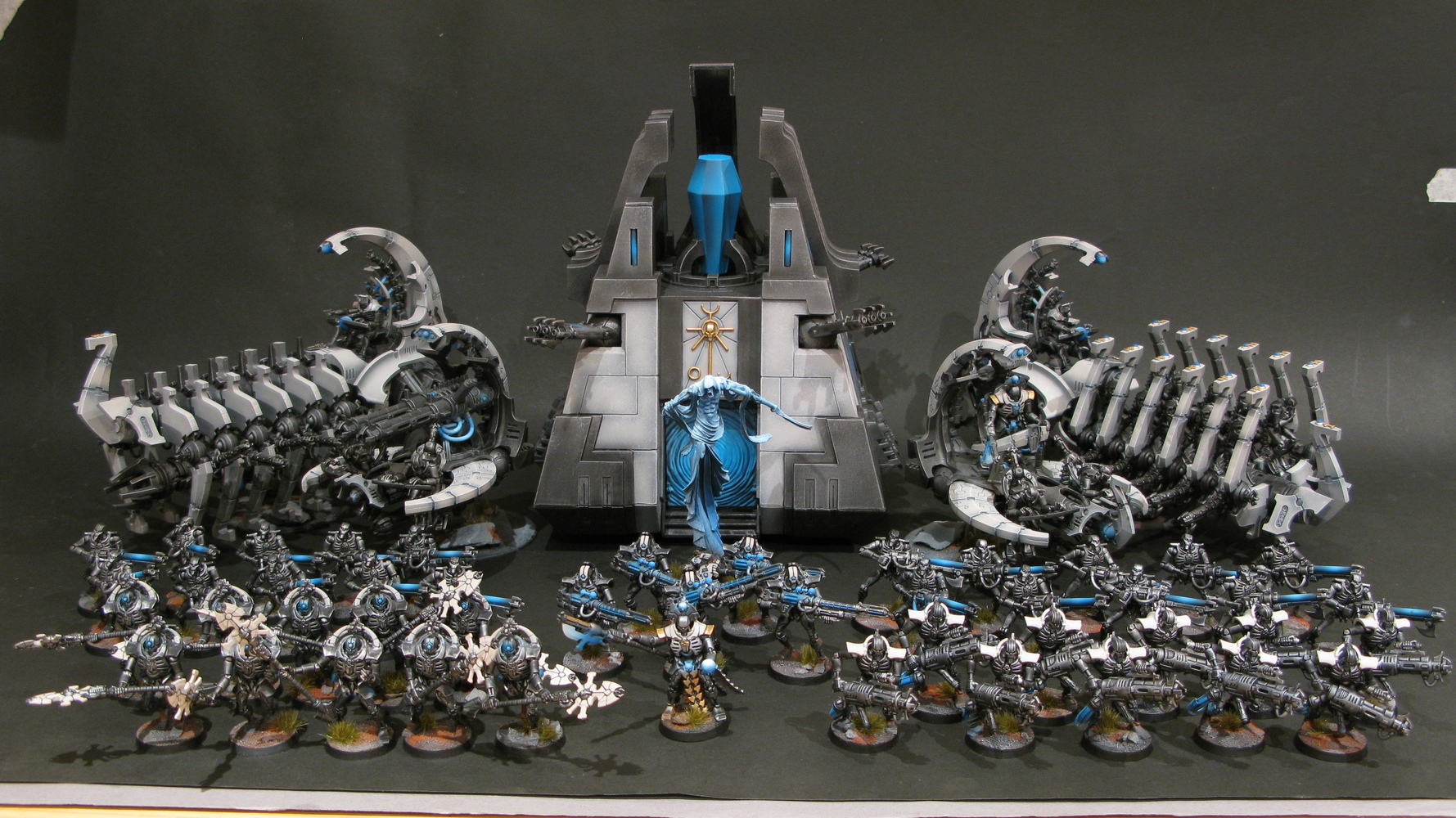
What I liked about the first color scheme is how tranquil it looked, and how it stood out with its light colors. Even the metals, which are the darkest parts of each model, are dark gray at best. I find it to my liking.
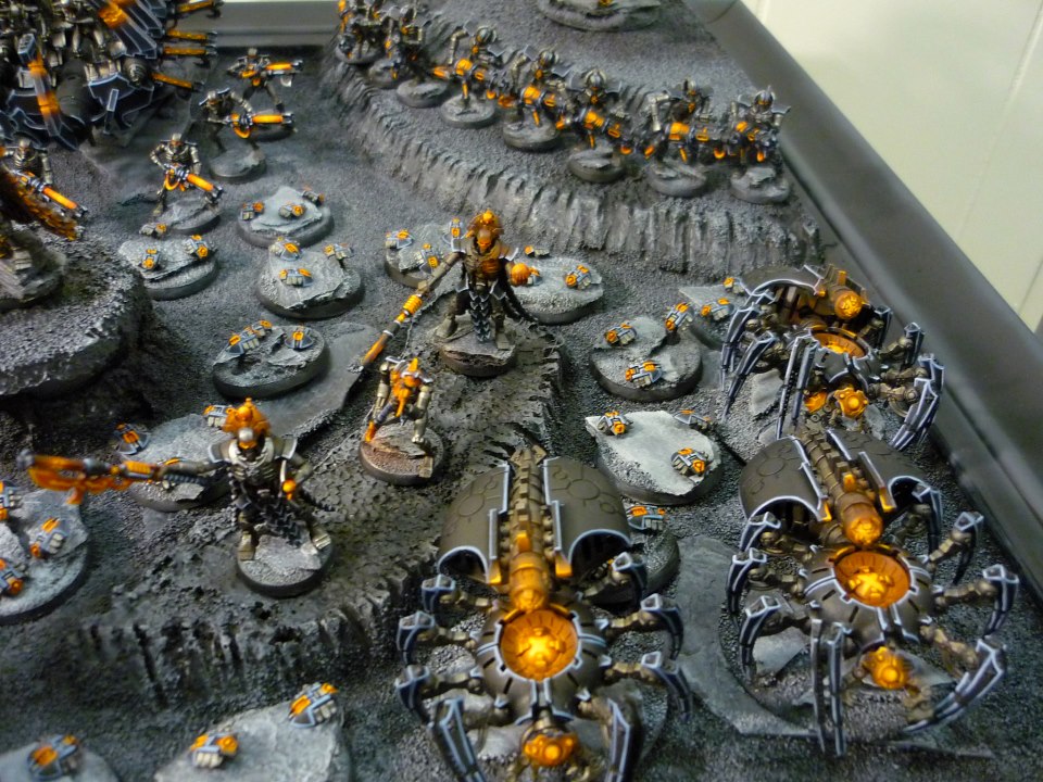
On the other hand, the black/orange theme looks angry. It does a lot of OSL and it does it well, giving me something to look up to when painting.
However, both armies (though, arguably, black/orange more) have the problem of lots of obscured detail. In the light colored army, while the whites and the blues were nicely detailed, the grays just blended in together. On the other hand, the black/orange only has visible detail around OSL. The rest is an indistinguishable mass of blacks and some blue lines here and there.
The solution, and my choice of color scheme became obvious when I realized this.
The metals, the core of the mechanisms, should be dark gray with plenty of OSL. This OSL should be orange and red, to communicate the rage my Necrons feel inside. I never liked using metallic colors, so matte gray gradients for metals were a natural choice, and besides, OSL on metallic surfaces is far more tricky to pull of, if you think about it. Instead of just shining light on surrounding detail, you need to think about reflections, glares etc.
On the outside, unnatural pale materials would provide armor, serving to provide contrast and a visible outline to each unit. This would serve to determine the pose of infantry, and the pattern of which surfaces are this pale color would serve to distinguish different unit types easily. Finally, as for the color denoting prestige, I didn't decide until painting my Overlord; at which point I just tried using light khaki colors and it worked great.
I originally decided to use light gray/white gradients for the armor material, exactly like in the light color army above. However, it looked too plain. I decided to throw in a hint of light blue just to contrast orange more, liked it, and kept going until it effectively became a light gray/light blue gradient.
It looked like it was radiating, and while this was not original intent, it looked great and I stuck with it. I think that it looked radiating because the overall lightness of the two colors is about the same, but the saturation of colors differs a lot. It's a gradient from color to gray scale instead of a more typical gradient from light to dark.
The exact technique I ended up using are the following, over a black undercoat.
Black metals:
- Couple of thin layers of Eshin Grey
- Light drybrush of Dawnstone
- Heavy wash of Nuln Oil.
Oranges:
- One thin layer of White Scar. Doesn't need to cover all recesses
- One thin layer of Red, covering all recesses
- Troll Slayer Orange on surfaces. All OSL is later done in Troll Slayer Orange too
- Fuegan Orange wash in recesses
- Gradient the orange onto Yriel Yellow.
- If the area should be exceptionally bright, lines and dots of Dorn Yellow.
Blues:
- Two-three thin layers of Dawnstone
- Drybrush of Fenrisian Grey, focusing on the middle of surfaces instead of highlighting edges
- On vehicles, outline edges with Ulthuan Grey (though I might have used White Scar initially?)