Monday, December 31, 2018

Adeptus Titanicus Warlord Titan Done!

Phew! A lot of stuff I've done for the first time here. Lacquer metallics, inks, value sketching, OSL using inks, painting in scratches and bullet marks. I'm very proud of how it turned out.

There are a few things I could have done better, and I hope I will in the future.

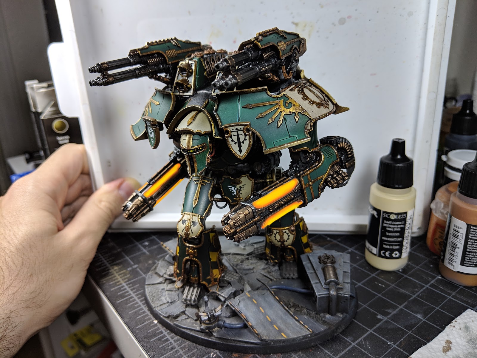
My value sketch didn't account for OSL enough, and it got completely lost when I layered on steel metallics. I maintained diffuse, zenithal lights and shadows all along, but when it came time to do OSL after having finished all painting and weathering, I found myself layering orange inks over black and that wasn't working out. I went back with a brush and reconstructed some of the OSL values after having painted the rest of the model; that's unfortunate.

The decal on his loin plate is too white. It's no surprise since it's a white decal, but I should tone it down. It's in deep shadow and it should pop out as much. The black side of that decal got ruined when I repainted the beige part of the plate. I may need to go back and reapply the black decals there, humph.

Due to the fact I was doing orange OSL over neutral to cold tinted metallics, there are regions where the light tints green a bit too much. I should have warmed up metallics in vicinity of where light would be, just to be ready for warm colors.

There were a few places where the paint has rubbed off from handling, and you can see them on the pictures. I've touched those up already but I don't want to do another photo session.

All that said, I'm still very proud of what I got here. I definitely stretched my limits here and have learned a lot from it.

Enough words! Thanks for looking.


Tuesday, December 25, 2018

Photo editing to define a paint scheme

So I was painting this gorgeous Warlord Titan. My plan for it was to use a lot of metallics and attempt to create an OSL effect on top of metals, just to see what that'd look like. OSL with non-metallic paints is a smarter way of doing this because with NMM you control the light entirely; while with metallics, room lights will bounce off the model and meddle with what you were going for.

Anyway!

The time came to pick the primary color of the light source. Since the model is in the cold green/beige gamut, (even the gold is soft, more beige than yellow), a warm saturated color would both stand out and complement everything well. In theory.

I took a photo of the model and attempted to edit in colors to see how that would look like.


I used Gimp for this purpose. I don't have Photoshop at home, and you're unlikely to need it for home use anyway. If you have access to Photoshop, great, this tutorial should apply. If not, use Gimp, it's great.

After opening the image, add two layers and paint them white using the paint bucket tool. You can check whether the layers are all white by turning their visibility on and off. Then, to both these new layers, add a Layer Mask that's fully transparent. Your two layers will go transparent again, that's fine. Think of a mask layer as a layer that hides parts of the layer that it's masking; here it's hidden everything.

Here's where the fun begins. Pick one of the layer masks and use the brush tool to draw on it. You'll see white come back where you draw; this is because the actual layer beneath the mask is all white. Use the eraser on the mask layer to hide parts of the actual layer.

Here I've used one of the mask layers as the backdrop, and the other as the highlight color. The second layer only covers what would be the brightest parts of those weapons.

After that, paint one of the actual layers orange, the other yellow. Use the paint bucket tool to do this. Since the actual layer is all one color, it will work fine. You'll get something like this:


Or maybe something like these:


Using other tools you can even rotate through the entire color wheel and see the changes that's making to the model. The images I've included here are only the ones that looked half decent; most other colors clashed too much.

Here I tried increasing the intensity by making the background yellow/orange instead of red/orange. I'm not a fan, but I was curious about what this'd look like:


Anyway, I'm going with red/orange/yellow. It looks the best; it stands out while fitting in at the same time.

I hope this helps; please ask questions below if you'd like to know more. Thanks for looking!

Saturday, December 1, 2018

On Tucking In the Redemptor Dreadnought's Belly

In the post about my Redemptor Dreadnought conversion, Ferrus Manus himself contacted me from ~28k years in the future to learn more about it. Since Redemptor Dreadnoughts won't exist for another ~10k years after that, I hope I'm not creating a time paradox here!

I found a bunch of work in progress pictures on my phone, so here they are. I hope they help! Plasticard is only used as a base for the Contemptor Mortis head; that would have to look a bit different for other Dreadnought heads.